
India
Post had invited Logo and tagline for India Post Payment Bank (IPPB) from
general public through MyGov portal of Government of India. For better participation, invitation was
conducted in the form of competition and declared a price money of Rs.25,000/-
each.
The last date for submissions was 09.07.2016 in the
earlier stage, but the date was re-fixed to 31.07.2016 due to poor
participation. Totally 4861 creations were
received when submission closed.
Persons participated in this competition were eagerly
waiting for the next stage of this competition after submitting their
creativity. They were regularly checking
the status of their submission in the Activity point of MyGov account.
First abnormality in this competition was found just
after few days of submission closure date and still continue. Some figures shown in the web page made me
confused. IPPB logo and tagline design
completion page in MyGov portal shows that total 600 submissions were approved
and remaining 4261 submissions out of 4861 were under review process. See the
screenshot below.

Still you can see this abnormality through the following
link
Lots of questions remaining unanswered while seeing the
review process.
1. Whether it is a
serious competition or for a media publicity?
2. What is meant
my Approved Submission?
3. Whether
actually reviewed all the submissions?
4. Whether it is a
part of preplanned drama?
It is clear that the submissions which are shown as
approved have not been reviewed actually.
Because the last submitted 600 creations are blindly taken as approved
submission. Remaining 4261 submissions
have been put it under the head “Under review”.
When you check the submitted date of the approved 600 creations, you can
clearly understand the fact that something wrong happened.
All the approved submissions have been submitted on one
month and one or two weeks ago. What a magic. Bulk approval has been done for
the Logos submitted on those days. How
this happened?
Now the voting started for selecting the apt logo and
tagline from 20 selected submissions.
But now the remaining 4261 submissions are under review. When we login to the MyGov account, it also
shows that your submission is under review.
How this happened?
Why this bad selection happened
Let us leave the above said discrepancies because
everyone wants to get a good logo for IPPB.
So we can analyze the selected 20 logos.
Selected 20 logos are shown below

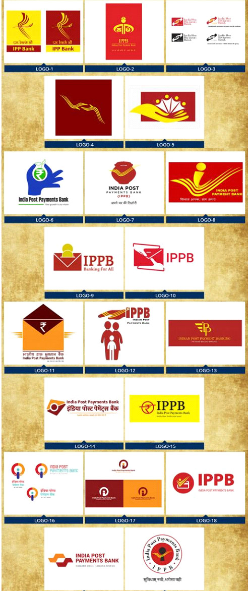
I respect and congratulate all the creators of these 20 selected
logos and I understand the effort you put it on each creation. But I have to express my views on these
logos. Don’t feel bad.
Most of the selected logos except two or three violate
all the rules of modern logos and it is very amateurish in style. And at the same time it is not in accordance
with the conditions fixed and published by the authorities.
The most important among them is that the logo should be
original. The original in the sense, it
should not be a modified form of other logo or should not have any special
image or symbol that indicating some other organization.
Most of the logos in the selected list cannot be considered as original creation because they are using full or part of India Post logo in one or other way. Some other logos are using the readymade clip art as portion in logos. India Post is a Government department and IPPB is a fully owned Government Company incorporated under Indian Companies Act 1956. Registration will not be possible if IPPB logo has any resemblance with India Post logo if it goes for registered trade mark.
Modern logo should be in such a way that it can be easily
marketable through web, social Medias or print media and its shapes can be
clearly visible in all size and colours.
Logo should be impressive if we use it on any surface or object. While considering the selected logos most of
them lack these qualities.
The era of complex logos ends and now everyone is behind
simple logos and most preferably square or round in shape because same can be
used as Mobile App icon, Favicon, Software icon, Avatar image, etc.
If a professional logo designer makes a review on these
selected logos, he never consider majority of them as deserving.
Two or three logos in the selected list are very professional
in nature. My doubt is only about the
review criteria and who made this review and what about other submissions which
are shown as under review.
What is in short?
1. Inviting logos
from public and declares price money.
2. 4861 logo
submissions happening.
3. Simply shown
last submitted 600 logos are approved without making any review.
4. Selecting 20
logos violating all logo criteria for voting.
5. Other 4261
logos are still under the review process.
What
about my choice?
I will select two logos from this list as ideal logos for
IPPB that is Logo 14 and 19. I am not
completely satisfied with these logos because it does not convey any brand
image but it possesses almost all qualities of a good logo.
Conclusion
The initiative of Government is appreciable but the
concerned department for whom it is carried out should pay adequate attention
in the execution process. Otherwise so
many discrepancies will be happened and so many questions will be raised. Then the activity planned for a good intention
will be questioned.
0 Comments